SwiftUI - 라디오 버튼 만들기
SwiftUI로 간단하게 뭐 만들다가 필요해서 만들어 봄
라디오 버튼은 UIKit으로는 만들었었는데 SwiftUI로는 만들어 본 적이 없다
선언형 UI인 Flutter는 써봤지만 SwiftUI를 써본 적이 별로 없어서 한 번 UIKit이랑 비교하면서 만들어보기로 함
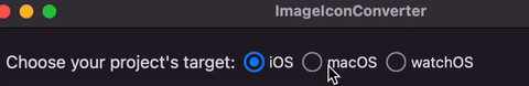
결과물
계획
생각해 본 구조는
- 토글되는 모양 뷰(위에선 원)
- 1과 실제 옵션 text가 포함된 뷰(하나의 버튼 아이템)
- 2들의 집합, 이 중 하나만 선택 되도록 하는 로직 포함
여기에 애니메이션, 툴팁, 커스터마이징 가능하게 등을 추가해보자
RadioButtonShape
우선 러프하게 짜 봄
struct RadioButtonShape: View {
    static let shapeSize = 16.0
    static let innerSize = 8.0

    @Binding var isSelected: Bool

    var body: some View {
        Circle()
            .stroke(.secondary, lineWidth: 2.0)
            .frame(width: RadioButtonShape.shapeSize, height: RadioButtonShape.shapeSize)
            .overlay(
                Circle()
                    .foregroundColor(.secondary)
                    .frame(width: RadioButtonShape.innerSize, height: RadioButtonShape.innerSize)
                    .opacity(isSelected ? 1.0 : 0.0)
                    .animation(.easeIn(duration: 0.2), value: isSelected)
            )
    }
}
일단 SwiftUI에는 Shape를 제공한다. 간단하게 Circle, Rectangle 등이 있다.
이걸 사용하면 원 안의 원 구조가 쉽게 구현이 된다.
protocol Shape : Animatable, View
Shape도 역시 프로토콜이고 View를 따른다.
UIKit으로 할 때는 뷰의 cornerRadius를 줘서 원을 만들고 border를 추가해서 바깥쪽의 원, layer를 추가해서 내부 원을 path로 그려줬었는데, 그거 비하면 훨 간단한 거 같다
그럼 CALayer 개념은 사라진 건가?? 해서 찾아보다가 WWDC19 Building Custom Views with SwiftUI를 봤는데, 24분 쯤부터 그래픽 부분이 시작하는데, SwiftUI에선 모든 게 뷰, 드로잉도 결국 뷰를 만든다고 하는 부분이 나온다
지금 슬쩍 기초만 보고 있지만 코드를 좀 보다 보면 진짜 다 ‘어쨌든 View 프로토콜을 따르는 무언가’ 취급을 한다. 뭔가 이해 되는 거 같기도 하고
RadioButtonItem
struct RadioButtonItem: View {
    var title = "aaaaaa"
    @State var isSelected = false

    var body: some View {
        HStack {
            RadioButtonShape(isSelected: $isSelected)
            Text(title)
        }
        .contentShape(Rectangle())
        .gesture(
            TapGesture()
                .onEnded({ _ in
                    isSelected = !isSelected
                })
        )
    }
}
HStack으로 Text와 RadioButtonShape를 가진다. 전체를 감싸서 탭 제스처를 인식하고, 상태 변수인 isSelected를 토글하도록 했다.
isSelected는 RadioButtonShape에 바인딩으로 넘겨서, 토글될 때마다 RadioButtonShape도 업데이트 된다.
.contentShape(Rectangle())처음에 이 코드 없이 그냥 했더니,RadioButtonShape을 탭해도 제스처가 인식이 안 되는 문제가 있었다. 선택되지 않은 모양의 경우, 가운데가 비어 있는데 투명한 부분은 탭 인식이 안 되어서 그랬음 그래서contentShape로 히트 박스를 HStack 네모 전체로 설정함
중간 결과
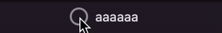
아무튼 이까지의 결과물을 보면 이렇게
위에서 계획한 1번(토글되는 모양 뷰), 2번(아이템)까지 완성
UIKit에 비해 훨씬 코드가 짧고 빨리 짜지는 기분ㄷㄷ
RadioButtons
struct RadioButtons: View {
    let options: [String]

    @Binding var selectedIndex: Int

    var body: some View {
        HStack(spacing: 10.0) {
            ForEach(Array(options.indices), id: \.self) { i in
                RadioButtonItem(id: i, title: options[i], selectedIndex: $selectedIndex)
            }
        }
    }

}
RadioButtonItem 그룹을 가지는 뷰 추가
찾아보니 기존 forEach와 비슷하게 동작하는 ForEach 역시 View를 따르며, struct다. id는 바뀐 부분만 효율적으로 뷰를 다시 그리기 위해 받는다고 함.
selectedIndex를 바인딩으로 가져 외부에서 인덱스의 변화를 알 수 있도록 했다.
RadioButtonItem 쪽의 로직도 단순히 토글되는 것이 아닌 그룹에 알맞게 동작해야 하므로 수정해주자
struct RadioButtonItem: View {
    let id: Int
    let title: String

    @Binding var selectedIndex: Int

    var body: some View {
        HStack(spacing: 5.0) {
            RadioButtonShape(isSelected: Binding(get: { selectedIndex == id }, set: { _ in }))
            Text(title)
        }
        .contentShape(Rectangle())
        .gesture(
            TapGesture()
                .onEnded({ _ in
                    if selectedIndex != id {
                        selectedIndex = id
                    }
                })
        )
    }
}
id를 추가로 입력 받고, 기존 @State var isSelected를 @Binding var selectedIndex로 변경했다.
그러나 RadioButtonShape 부분까지 인덱스 정보를 줄 필요는 없기 때문에, Binding(get: { selectedIndex == id }, set: { _ in }를 통해 바인딩 변수를 Bool로 변환하여 넘겨주도록 한다.
또, 탭 제스처에서 현재 선택된 인덱스가 내 id와 다를 경우에만 업데이트 하도록 함.
struct RadioButtonShape: View {
    static let shapeSize = 16.0
    static let innerSize = 8.0

    @Binding var isSelected: Bool

    var body: some View {
        Circle()
            .stroke(isSelected ? .blue : .secondary,
                    lineWidth: isSelected ? 2.0 : 1.5)
            .frame(width: RadioButtonShape.shapeSize,
                   height: RadioButtonShape.shapeSize)
            .overlay(
                Circle()
                    .foregroundColor(isSelected ? .blue : .secondary)
                    .frame(width: RadioButtonShape.innerSize,
                           height: RadioButtonShape.innerSize)
                    .opacity(isSelected ? 1.0 : 0.0)
            )
            .animation(.easeIn(duration: 0.2), value: isSelected)
    }
}
RadioButtonShape 쪽은 UI 좀 더 다듬기
현재 상태에 따라 색깔, lineWidth 등의 변경도 추가
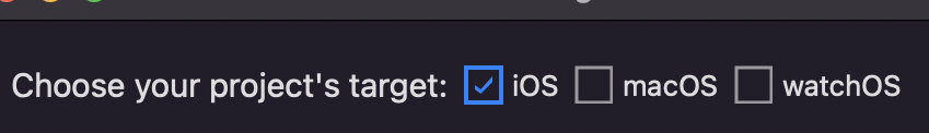
이까지 하면 위에서 본 결과 중 기본 기능은 다 넣었다!!
여기다가 이제 툴팁도 넣고, 좀 더 자유로운 커스터마이징도 추가해 보자
툴팁(popover) 추가
struct RadioButtonItem: View {
    @State private var showPopover = false

    var body: some View {
        HStack() {
            // ...
        }
        .popover(isPresented: $showPopover) {
            Text(description)
                .padding(padding)
        }
        .gesture(
            LongPressGesture()
                .onEnded({ _ in
                    showPopover = true
                })
        )
    }

}
RadioButtonItem에 툴팁을 추가하자
저번에 하던 프로젝트에서는 UIKit에는 툴팁이 없어서… 안드로이드 팀도 그렇고 딴 거 개발할 것도 너무 많아서 결국 툴팁을 없애는 방향으로 디자인 명세를 수정 부탁드렸던 적이 있었는데… SwiftUI는 매우 간단하게 추가가 가능하다(UIKit의 popover는 아이패드에서만 툴팁 형태로 됨)
상태 변수로 showPopover를 추가하고, 꾹 눌렀을 때 이걸 true로 지정하면 됨
그리고 .popover(isPresented:)에 바인딩 변수로 넘겨주면 된다. 한 번 showPopover가 true가 되어 팝오버가 뜨면 알아서 false로 바꿔줌 굿
역시 content 클로저를 받으므로, 뷰 만들고 싶은대로 만들면 끝
커스터마이징
사용에 있어 자유도를 높이자
일단 RadioButtonShape가 굳이 원 모양만 사용하는 게 별로다. 보통 네모 안에 체크 모양 등 다양하게 조합이 가능하면 좋겠다. 색상도 그렇고
struct RadioButtonShape: View {
    struct Configurations {
        var shape: any Shape = Circle()
        var innerShape: any Shape = Circle()

        var shapeSize: CGFloat = 16.0
        var innerSize: CGFloat = 8.0

        var color: Color = .secondary
        var selectedColor: Color = .blue

        var lineWidth: CGFloat = 1.5
        var selectedLineWidth: CGFloat = 2.0
    }

    let configs: Configurations
}
Configurations을 추가하고 UI는 전부 configs의 값을 사용하도록 수정
struct RadioButtonItem: View {
    struct Configurations {
        var font: Font = .body
        var spacing: CGFloat = 5.0
        var popoverPadding: CGFloat = 16.0
    }
}
비슷하게 RadioButtonItem도 폰트 등을 받게 하면
RadioButtons(shapeConfigs: .init(shape: Rectangle(), innerShape: Checkmark()),
             options: radioOptions,
             descriptions: radioDescriptions,
             selectedIndex: $selectedIndex)
이런 식으로 자유롭게 쓸 수 있다.
Checkmark는 직접 추가한 커스텀 shape
Checkmark
struct Checkmark: Shape {
    func path(in rect: CGRect) -> Path {
        var path = Path()
        path.move(to: CGPoint(x: rect.minX, y: rect.fractionY(3, 4)))
        path.addLine(to: CGPoint(x: rect.fractionX(1, 3), y: rect.maxY))
        path.addLine(to: CGPoint(x: rect.maxX, y: rect.fractionY(1, 3)))
        path.addLine(to: CGPoint(x: rect.maxX, y: rect.minY))
        path.addLine(to: CGPoint(x: rect.fractionX(1, 3), y: rect.fractionY(3, 4)))
        path.addLine(to: CGPoint(x: rect.minX, y: rect.fractionY(2, 4)))
        path.addLine(to: CGPoint(x: rect.minX, y: rect.fractionY(3, 4)))

        return path
    }
}
Path를 제공해주면 된다.
위치 계산을 편하게 하려고 fractionX랑 fractionY도 CGRect에 extension으로 추가해 줬다
extension CGRect {
    func fractionX(_ numerator: Int, _ denominator: Int) -> CGFloat {
        return (maxX - minX) / CGFloat(denominator) * CGFloat(numerator) + minX
    }

    func fractionY(_ numerator: Int, _ denominator: Int) -> CGFloat {
        return (maxY - minY) / CGFloat(denominator) * CGFloat(numerator) + minY
    }
}
minX ~ maxX 사이의 3분의 1 지점 구하기 등을 rect.fractionX(1, 3)으로 사용
마지막으로 기존 RadioButtons에서 HStack을 가지고 있어서 가로 방향밖에 안 됐었는데
struct RadioButtonsCollection: View {
    var body: some View {
        ForEach(Array(options.indices), id: \.self) { i in
            RadioButtonItem(configs: itemConfigs,
                            shapeConfigs: shapeConfigs,
                            id: i,
                            title: options[i],
                            description: descriptions[i],
                            selectedIndex: $selectedIndex)
        }
    }
}
스택은 없애고 그냥 컬렉션으로 바꿔서
HStack {
    RadioButtonsCollection(...)
}

VStack(alignment: .leading) {
    RadioButtonsCollection(...)
}
사용할 때 쓰고 싶은 Stack 방향대로 사용할 수 있게 하기
근데 이게 또 신기한 게
UIKit에서는 UIStackView에다 서브뷰들 담긴 뷰 넣어도 해당 뷰만 정렬하지 서브뷰들이 정렬되지는 않는데
지금 RadioButtonsCollection이 ForEach로 만들어낸 body라는 하나의 View를 제공하는데 HStack이나 VStack에 넣으면 알아서 해당 스택 정렬을 따르네요
alignment가 안 정해진 서브뷰들은 부모 거를 따르게 되는 건가??
최종 코드
최종 코드
struct RadioButtonsCollection: View {

    var itemConfigs: RadioButtonItem.Configurations = .init()
    var shapeConfigs: RadioButtonShape.Configurations = .init()

    let options: [String]
    let descriptions: [String]

    @Binding var selectedIndex: Int


    var body: some View {
        ForEach(Array(options.indices), id: \.self) { i in
            RadioButtonItem(configs: itemConfigs,
                            shapeConfigs: shapeConfigs,
                            id: i,
                            title: options[i],
                            description: descriptions[i],
                            selectedIndex: $selectedIndex)
        }
    }

}
struct RadioButtonItem: View {

    struct Configurations {
        var font: Font = .body
        var spacing: CGFloat = 5.0
        var popoverPadding: CGFloat = 16.0
    }

    let configs: Configurations
    var shapeConfigs: RadioButtonShape.Configurations

    let id: Int
    let title: String
    let description: String

    @Binding var selectedIndex: Int
    @State private var showPopover = false


    var body: some View {
        HStack(spacing: configs.spacing) {
            RadioButtonShape(configs: shapeConfigs,
                             isSelected: Binding(get: { selectedIndex == id }, set: { _ in }))
            Text(title)
                .font(configs.font)
        }
        .contentShape(Rectangle())

        .popover(isPresented: $showPopover) {
            Text(description)
                .padding(configs.popoverPadding)
        }

        .gesture(
            TapGesture()
                .onEnded({ _ in
                    if selectedIndex != id {
                        selectedIndex = id
                    }
                })
        )
        .gesture(
            LongPressGesture()
                .onEnded({ _ in
                    showPopover = true
                })
        )
    }

}
struct RadioButtonShape: View {

    struct Configurations {
        var shape: any Shape = Circle()
        var innerShape: any Shape = Circle()

        var shapeSize: CGFloat = 16.0
        var innerSize: CGFloat = 8.0

        var color: Color = .secondary
        var selectedColor: Color = .blue

        var lineWidth: CGFloat = 1.5
        var selectedLineWidth: CGFloat = 2.0
    }

    let configs: Configurations

    @Binding var isSelected: Bool


    var body: some View {
        AnyShape(configs.shape)
            .stroke(isSelected ? configs.selectedColor : configs.color,
                    lineWidth: isSelected ? configs.selectedLineWidth : configs.lineWidth)
            .frame(width: configs.shapeSize,
                   height: configs.shapeSize)
            .overlay(
                AnyShape(configs.innerShape)
                    .foregroundColor(isSelected ? configs.selectedColor : configs.color)
                    .frame(width: configs.innerSize,
                           height: configs.innerSize)
                    .opacity(isSelected ? 1.0 : 0.0)
            )
            .animation(.easeIn(duration: 0.2), value: isSelected)
    }
}
굿
댓글남기기